
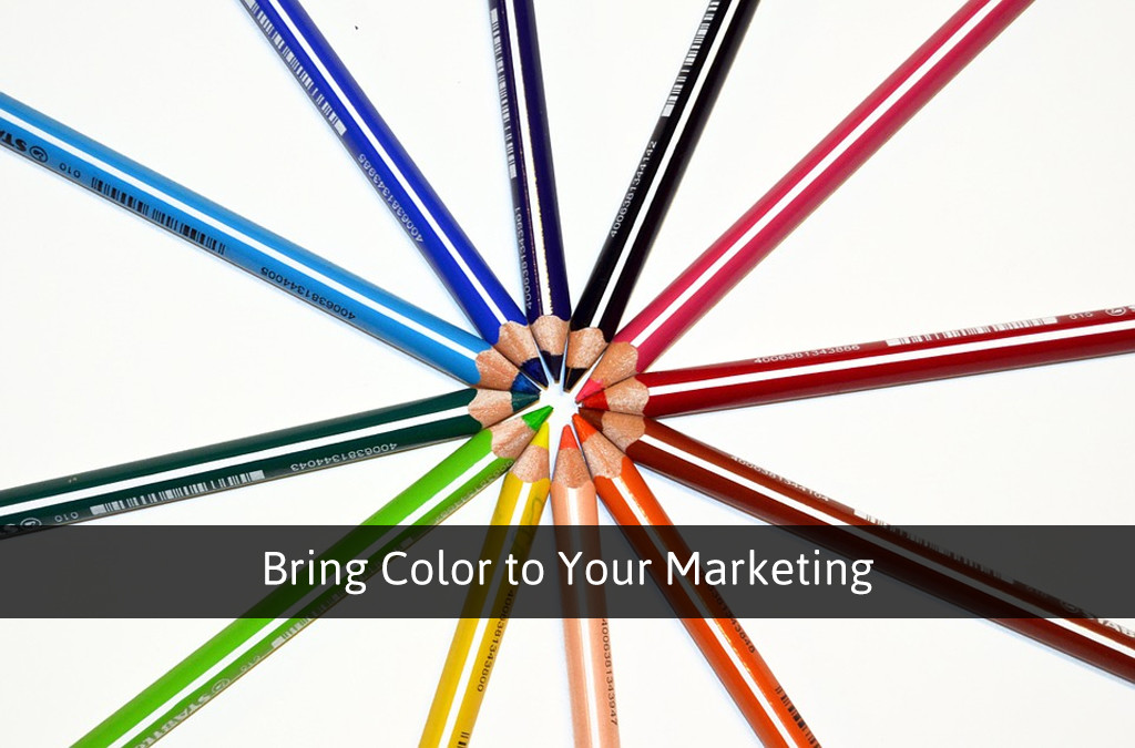
Marketing, whether done traditionally or digitally, will always involve the use of color, and there’s no questioning it. Your choice of color may have been a side note in the past, but I’d like to get you thinking more about your color choices. Color may not have been a priority to you before reading this, but there is a deep psychology behind colors in terms of visual marketing content, so let’s talk about how you and your agency can use this psychology to your advantage.
Color Theory
Anyone who considers themselves a marketing professional should have at the very least a basic understanding of color theory, because color shows up constantly through the use of visual content. There are a few things you should understand about color theory, and we’ll demonstrate each through visuals:
First things first, you have your primary colors, which are red, yellow, and blue.

After that, you have your secondary colors, which are made up of purple, green, and orange. We reach secondary colors by combining primary colors; red combined with blue makes purple, blue combine with yellow makes green, and red combine with yellow makes orange.

After that, we can break it down one step further, into tertiary colors, which are combinations of secondary and primary colors that are adjacent to one another in the color wheel. These colors are generally named after the colors that combine them, such as red-orange or yellow-green.
Completing the Color Wheel
Now, what we’ve already gone over covers all of the pure colors in the color wheel. A pure color is a color in its purest form, or in other words, the color has not been altered at all to offset the intensity. There are three ways to offset color intensity, as follows:
The first is called color tints, and these are created by adding white to the pure colors in different amounts.
The second is called color shades, and shades are created by adding different amounts of black to the pure colors.
The last is called a color tone, which is created by adding grey (both black and white) to a color to make it slightly more dull.

Choosing Color Combinations
When it comes to choosing your color combinations in your visual content, there are several things to keep in mind. The first thing we’ll go over is using contrast in your visuals or designs. Contrast is when you make one color stick out from another. Using contrast in your visuals helps one element stand out from another, and is great for when you need text to be read, a logo to be clearly visible, or your call to action to stick out from the rest of your content. There are a few ways you can create contrast within your content:
The first is by adding black or white to change the intensity of your color. For instance, if you have a shade of blue (blue with black added) as your background, and a tint of blue (blue with white added) used as your object that you want to create contrast with, it will be easier to look at:

Another way you can create contrast is by using colors that are opposite of one another on the color wheel, better known as complementary colors. Complementary colors are as follows: blue is the opposite of orange, red is the opposite of green, and yellow is the opposite of purple.

Here’s where it gets a little interesting; you can also create contrast using split complementary colors. Split complementary colors is when you have a set of complementary colors, but you only use one of them, and on the opposite side, you create contrast by using a combination of the other complementary color’s tertiary colors, instead of the pure color itself, as demonstrated below:

As you can see, there are several ways to create contrast within your visual content or agency design (whether it be your website, social media, app, or more). Contrast will allow your core message to pop out from the background, or for your text or logos to be viewed a little easier. There’s another aspect to creating visuals you may want to keep in mind as well though, and that’s the use of colors that are similar, and there are two methods to using similar colors that will make your visuals a bit more appealing to the eye:
The first is to use analogous colors together, or colors that are very close to one another on the color wheel. By combining several analogous colors, your visuals will become appealing and welcoming, and it will provide for a better contrast if you use one contrasting element over a beautiful background of analogous colors:

The other way to use similar colors is to use monochromatic colors together. Monochromatic is when you make different shades, tones, or tints of the same pure color and use them in combination in one visual. Again, if you have one contrasting element to a wide range of monochromatic colors on a visual, then it will pop out better and give the visual a nice touch overall:

Color Psychology
So now that we’ve covered the basis of color theory, we can talk about why it’s so relevant to your marketing efforts, because I know you’re not here to become an art teacher. When the human eye perceives color, it doesn’t just see a color, but instead there are also emotional connotations tied with each color’s perception. I’ll include a full list of human emotions related with each color in the visual below:

Not only that, but according to a large scale survey, there are even certain words or phrases that can relate to certain colors. The most notable results were as follows:
- Trust: 34% answered blue, 21% answered white, and 11% answered green
- Security: 28% answered blue, 16% answered black, and 12% answered green
- Speed: red was the clear winner at 76%
- Cheapness: 26% answered orange, 22% answered yellow, and 13 answered brown
- High Quality: 43% answered black, and blue followed at 20%
- High Tech: black was the first choice at 26%, followed by blue and grey, both at 23%
- Reliability: 43% chose blue, followed by black at 24%
- Courage: the majority favored purple at 29%, then red at 28%, and blue at 22%
- Fear/Terror: 41% said red, followed by black at 38%
- Fun: 28% answered orange, 26% answered yellow, and 17% answered purple
Color Influences
Color psychology and color influences are very similar in nature, in that perception of a color can mean different things to our brains’ connotations. Generally speaking, when it comes to color influences, there are a few things you’ll want to keep in mind. Bright colors generally encourage physical activity to some extent, and can almost make time seem like it’s passing slower. Cooler colors are more geared toward mental activity, and can make time seem like it’s moving much quicker. There are also cultural differences in color perception, and even differences in the way males and females perceive color, but we won’t get too much into detail on those subjects here.
Bringing Your Marketing to Life
It should be clear that when it comes to marketing, your choice of colors in any and all of your visual content is crucial to the success of your conversion rates. It all boils together through the creativity you want to bring to the table. You can use your branded colors on your website to make your call to action pop out from the rest of the page using contrasting colors. You can put a positive connotation into a visual about physical health by incorporating colors that remind the brain that physical activity is a good thing. You can even make your contact information stand out, or put it in blue to remind people to feel secure or that you’re trustworthy when reaching out to you. The possibilities here are endless, but knowledge is power, and I hope you put that power to great use through engaging and thoughtfully crafted visual content for your audience.
Happy Marketing everyone!