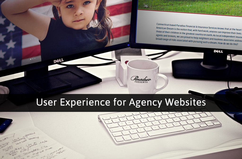
Every insurance agency has an opportunity to either win or lose with each visit they get on their website. Each time a prospect, customer, or client visits your website, it’s your job to make sure that they find what they are looking for, easily, and enjoyably. You have an opportunity, with each visit, to look for a response from your audience, and that could be a good or a bad thing, depending on how well-designed your website actually is. It’s important that you track your website’s efficiency through data and metrics, and capitalize on what works while eliminating what doesn’t work, which all boils down to a little bit of website re-designing. Let’s go over five quick tips you can embrace to improve the user experience of your insurance agency’s website..
- It Starts with a First Impression
That’s right, when your audience makes their way to your website, they initially decide what they think or feel about your insurance agency within seconds. If your website isn’t giving a positive, strong first impression, then it’s probably time for a bit of re-designing, visually speaking. When someone visits your website, generally speaking, they will observe things in a left-to-right and top-to-bottom fashion here in North America. The first thing they will most likely see is your agency’s logo, and if not, you should position it right at the top of your website. They should also see your agency’s phone number in the upper-right hand corner of your website, so that it is easy for your visitors to get in touch with you. After that, they start looking at the finer details. Generally speaking, your audience will be attracted to colors of bright combinations, because websites that have utilize darker color schemes generally don’t have quite as strong of a user experience. It’s also important that you stick to your insurance agency’s branded fonts, and that you choose fonts for your agency that have an aesthetic appeal. It’s also drastically important to include visual content, because visual content is still king in the world of digital marketing. Including photos of your agency, the owner, or branded agency visuals that are crafted by your marketing team will help with pushing the envelope.
- Response and Engagement
People have voices, and trust me, they want to be heard. When your audience shows up to your website, they may see or read about something that sparks their interest, and they may want to share their opinion about the material. It’s important that you make it easy for your audience to interact with you via your website. One example how we do this with our agency is to include a comments section on our blog, as well as the ability to share our content to social media. Whenever someone does interact with your website though, it’s important to recognize it. If you don’t engage with your audience after they, for example, leave a comment one of of your posts, they will think they are talking to a wall. You have to not only allow them to have a voice, but also make sure they know it is heard!
- Call-to-Actions – Sealing the Deal
Your insurance agency’s website is your digital marketing powerhouse, but it needs to have a purpose; it needs to be able to make “closings.” Now, traditionally speaking, we may hear the word “closing” and think of selling a policy in the insurance space. In terms of your website though, a closing could just mean coming in contact with your agency to help move the process along; after all, your website is the bridge between customers’ problems and getting the service they need. Your website needs to have call-to-actions included, or buttons/forms that serve a specific purpose. Some of our call-to-actions include filling out and sending a “contact us” form for us to review at our agency, getting a free quote, or downloading our mobile app. By incorporating calls-to-action, you can get a warm lead closer to being sold a policy, or help a faithful customer with finding an answer to a problem they are experiencing.
- Do some Spring Cleaning
Now’s the perfect time of the year to tighten up on the odds and ends with your insurance agency’s website with a little bit of “spring cleaning.” As I mentioned earlier, you should track what does and doesn’t work. It’s important to get rid of what you find isn’t working though, or else it can become stagnant content (content that has no interaction, and essentially serves no purpose since it’s not seeing any activity). Another thing you’ll want to think about is your website’s load time, or how quickly all of your content displays for each visitor. Cutting down on your stagnant content can help your load time, but there are other more advanced strategies you can think about to help your load-times as well; to explore more options I would highly suggest reaching out to a web-design professional who can help you with picking up your speeds.
- Get them Talking
Last but not least, word-of-mouth still goes a very long way in today’s complex world of sales and marketing, and it is crucial that you get your customers talking about your agency online. Once you do, you can include testimonials and other types of feedback right on your website, just like we have done with Paradiso Insurance. Testimonials build trust, because people want to hear what their peers have to say. By including testimonials and feedback, you’ll be able to see more calls-to-action being triggered, which means more people on their way to opening a policy with your agency.
Overall, if you incorporate these five simple tips into your insurance agency’s digital marketing plan, you’ll be able to see more traction with your website, generate more leads, and reap a strong positive ROI at the end of the day. Happy Marketing everyone!